Painting With Bright Colors And The Vegas Show
Hello Blog Friends and Welcome to another class!
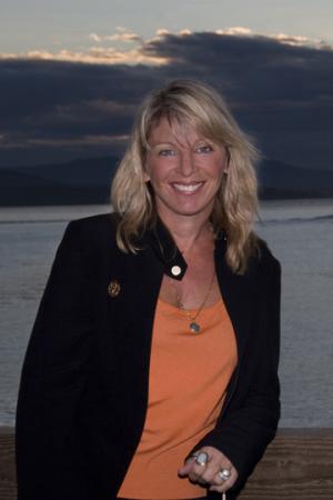
It has been beautiful in Bellingham this week…80 today… and I took advantage of the great weather and went for a ride with my friend Erin Baker.

Seize The Day!
I hope you are enjoying the glories of approaching fall…Happy Equinox on the 21st!
Now onto class…
***PAINTING WITH BRIGHT COLORS***
This week I am painting for the show I am attending next week in LAS VEGAS.

More info? Click here!
I am changing from the somber browns and grays of the horses and putting on a brighter hat!
I have chosen yellows, oranges and turquoise for this set of desert images (opposite colors).
Orange and blue is a tricky color combination…I hope these tips will help you in your painting.

I often use opposites.
As I have mentioned before, the best paintings have a solid color scheme that runs throughout the project.
In the picture below, you can see the orange to blue wash.

The color of the sky is always reflected in the landscape, because of the way light bounces.
I am working on two paintings this week , so they will have similar colors.
This way they will be a better grouping.

The orange and blue is perfect for a hot desert sky!
The orange and blue when mixed make a great desert sand.

I love painting with these bright happy colors.
Working on two paintings at a time, allows me to move quickly because there is no wait time for the washes to dry.
You just go on to the other image and you have the benefit of having all the colors pre-mixed.
If you look closely at the image below, (Click on any image to enlarge it) you can see that I am placing blue in the butterfly’s wing.
In real life, this butterfly is only black, brown, orange and white, but an artist has LICENSE!

Putting the sky color in your subject gives it much more life.
OH MY!…What happened.

I diverged from the original orange and blue plan on this one. 🙂 ...MORE LICENSE.
Sometimes you just want to break out the colors. The desert loves bright because where there is lots of sunlight, every color in nature becomes more intense.
COLORS MAKE US HAPPY… and when you paint them…or wear them they can elevate your mood.
But they can be tricky to execute…so let us analyze:
- Purple, green-turquoise and orange are a special group of colors called secondary colors.
- Red, Blue and yellow are the primaries.
- The secondaries are like music in a minor key…or like women: feminine.
- As a rule…secondary colors are liked by women and primaries are liked by men.
Remembering this can really help when you pick a color scheme!

Both of these pieces were designed with women in mind. You can see in this butterfly, the addition of purple in the orange flowers and butterfly wings.

Of course cactus are not purple and turquoise...or are they?
Next time when you go to the desert southwest check it out. Many are shades of these colors… I have just exaggerated it!
Title: “Bloom Where You Are Planted”
In the last stage, I paint the shadows and the highlights.
Can you see them?

"May All Your Dreams Take Flight"
Now onto a new set of colors…Turquoise and Brick Red.

Mix it up!

I will finish two more compositions over the weekend and have them all ready for VEGAS.
Remember, color is a joy to work and live with. Go out today and put some color into your life…flowers, tomatoes, a new piece of glass, a painting that makes you happy!
And if you know someone who needs some encouragement…take something colorful to them!
I had a special class with Audra this last week and we walked down to the beach.
She is a joy to work with.

Jody Bergsma and Audra Hitz

She is working on a snowman for her Christmas show…and really learning how to put color down on the palette!

Audra in the studio
I close this week hoping all of you enjoy these great last moments of summer.
Invite some friends over…eat outside and…give thanks for the beautiful world we live in.

Pamela Cumming, David Gregory and Jody Bergsma. Friends and neighbors on Chuckanut Mountain.
Till next week…
P.S. Save the dates…. In just two weeks ….two events here at the Bergsma Gallery.
Bergsma Studio Tour Friday – Sunday October 2 – 4th. I will be displaying my watercolor abstracts and oil paintings.
Bergsma Fall Show and Open House Friday – Sunday October 9th-11th. Specials and Sale items!